Combridge
Bridging the Gap Between the Brand’s Promise and Its Customers
Brand
service line
Visual Content Creation
Content Performance
UX Strategy
UI Design
Digital Identity Design
The Case
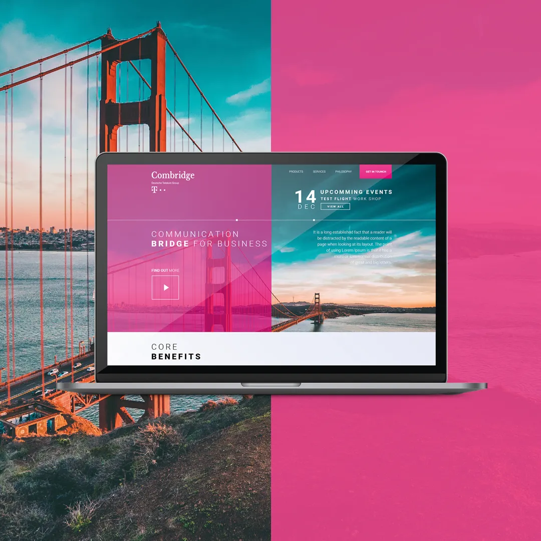
Combridge, as a premium subsidiary of Deutsche Telekom Group, has established a strong position in the B2B segment, where it delivers its core activity as an IT&C integrator. However, as competition grew stronger, the neglected brand strategy started negatively impacting the brand’s message. A rebranding strategy for the company’s digital identity became increasingly vital.
The Solution
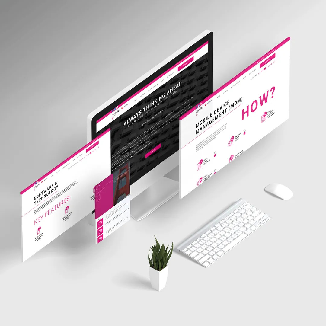
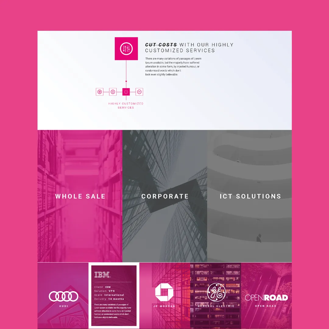
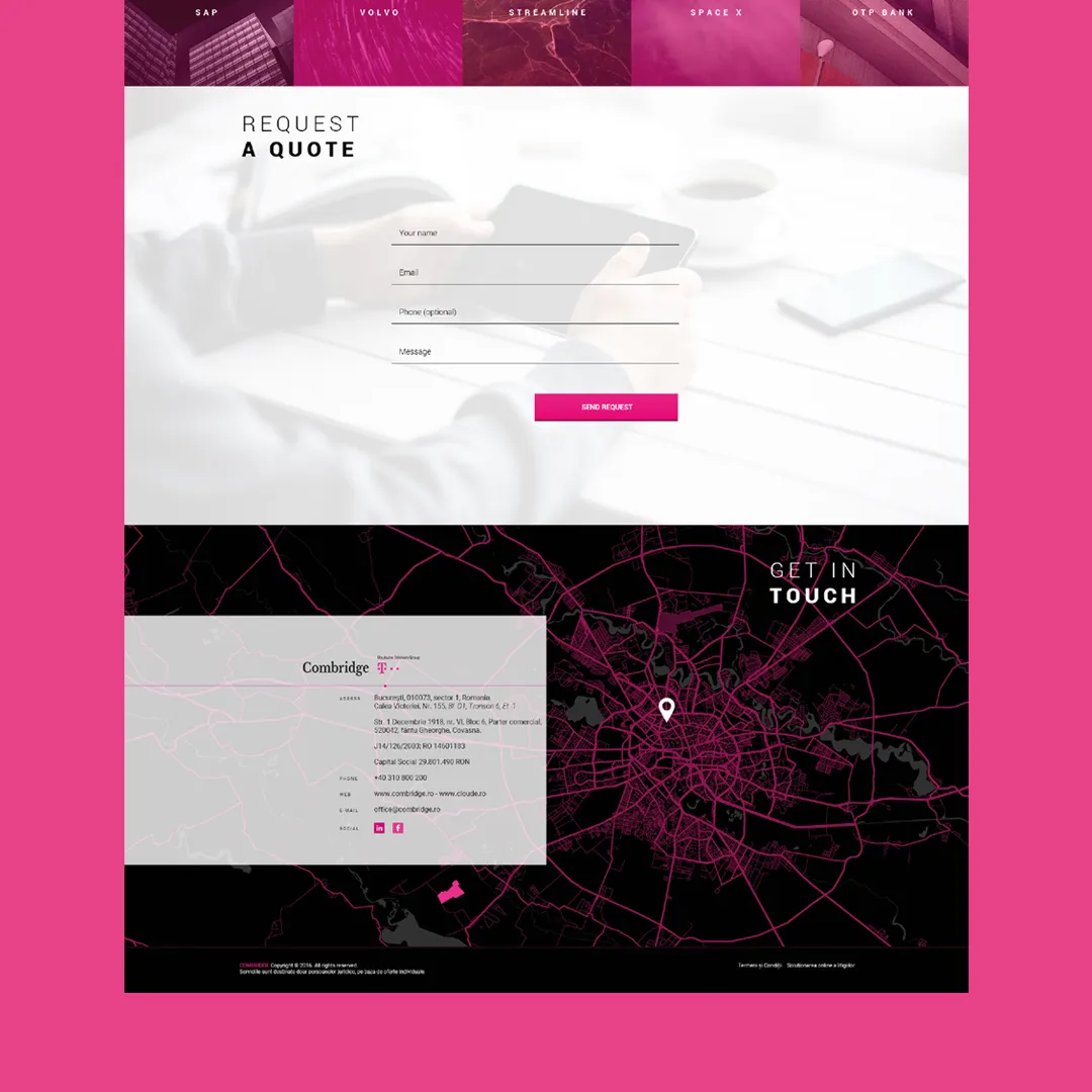
A solid style guide containing the company’s values, proper uses of the logo, colour tones, typefaces, tips for layouts, printing rules, copywriting instructions, and wireframes for web design. A brand book that is aligned with the company’s design standards and acts as a key document both internally and externally.
Combridge, as a premium subsidiary of Deutsche Telekom Group has established a strong position in the B2B segment, where it delivers its core activity as an IT&C integrator. However, as competition grew stronger, the neglected brand strategy started to have a negative impact on the brand’s message. A rebranding strategy for the company’s digital identity was more and more needed.
Firstly, we started to work on a Brand book which communicates the company’s design standards and acts as a key document both internally and externally. The style guide contains the company’s values, proper uses of the logo, color tones, typefaces, tips for layouts, printing rules, copywriting instructions and wireframes for web design.
Challenge accepted
At first, it may sound easy as a walk in the park, but the start was bumpy indeed. It wasn’t simply about rebranding an outdated look and feel, due to the fact of having to be compliant with the corporate standards and still needing to achieve a high level of originality.
So, Combridge wanted to be unique on the market and not to be confused with any other less trusted brand, and at the same time, all the visual brand elements needed to be compliant with the rules of Deutsche Telekom. Now, being part of a large corporation allows very little room for changes.
The brand message used to be very technical and hard to understand for the target audience, so we needed to redefine its core message: combridge solves your it&c challenges without you needing to have technical knowledge.
Once we had set straight the key messages and values on the level of wording, we could move forward a lot easier on strengthening the relationship between the brand and its customers by creating a new, visually unique guideline, thus offering a better approach in copywriting as well.

Levente Csenteri
“Attila amazed me with his dynamic and professional way of working. We started to talk about his company and about the services he provides. Thanks to rebranding and following the new strategy, the company has been repositioned. This happened because of Cognitive Creators’ professional services.”