Color Metal
Strike While the Iron Is Hot - Breaking Through Barriers towards Internationalisation
Brand

service line
Brand strategy creation
Visual Content Creation
UX Strategy
UI Design
Digital Identity Design
User Persona & Market Trend Research
The Case
Today, Color Metal is a major player in the distribution of non-ferrous semi-finished products in Eastern Europe. In 2018 the company, with its headquarters in Odorheiu Secuiesc, Romania, has already started expanding their sales efforts in the neighbouring countries. With consolidated internationalisation in mind, they have recognised the urgency of rebranding. They needed a viable visual representation of their brand to establish a solid regional presence. Our collaboration stemmed from this recognition.
The Solution
Working closely with the company’s marketing team, we created a renewed brand identity, including a vast collection of visual elements for both digital and physical platforms. With the aim of expanding their B2B digital flow, we’ve assessed a 12-month communication and brand strategy. We managed to help Color Metal transition from a local to a sustainable regional brand strategy compliant with international trends.
Breaking through barriers
Venturing into uncharted waters and deep diving into a highly complex industry was a prerequisite for outlining the strategy Color Metal needed. Therefore, understanding the importance of the non-ferrous metal industry at the cross-section of the automotive, aerospace, mechanical engineering, and construction sectors has been the first major task we had to tick off. We had to break down the industry specifics to fully understand every tiny detail and reassemble the concept to create a solid digital presence for the company.

Once we managed to break through and get a clear vision of the industry specifics in the context of marketing, we created an improved digital strategy and renewed brand identity accompanied by on-the-ground solutions, which had to be both adaptable and appealing to different cultures and economies in the world.
Quality starts by exceeding expectations
At the very beginning, it was clear that Color Metal and CC share the same values: we both are driven by supporting our clients with solutions that aim to exceed expectations. That is one of the reasons why we didn’t have a hard time finding the most fitting tagline: “Partner in Engineering”.
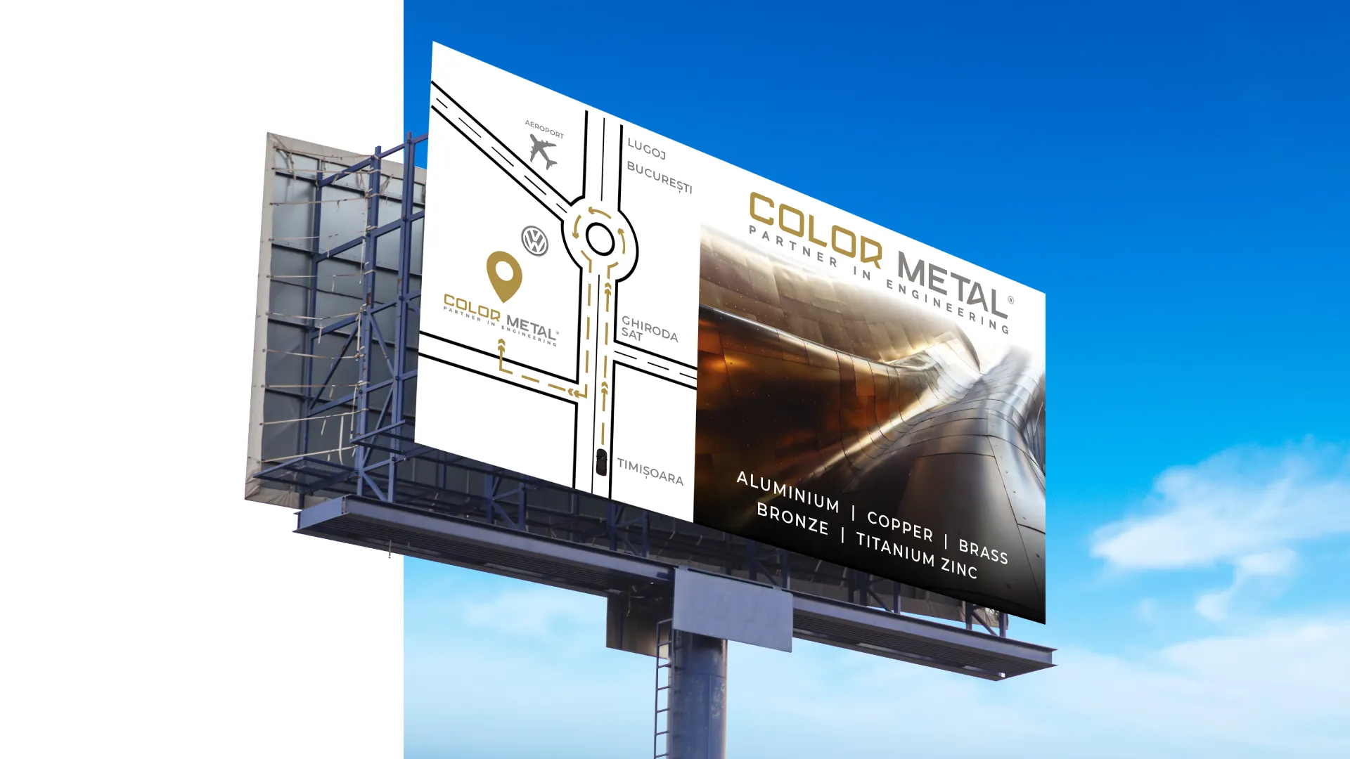
In the brand book, we’ve included a distinguished colour palette that works effortlessly both on digital and physical means. And to spice up the challenge, in the case of a number of brand elements planned to be placed in various outdoor locations, we’ve also had to consider all the environmental factors affecting their endurance over time.


First, we focused on Romania, where the company had offices in 4 different cities. At these locations, we had to keep in mind that the heavy traffic and dust have adverse effects on the quality of outdoor advertising platforms such as billboards. Therefore, assessing the colour selection used in the core brand elements had to fulfil the longevity criteria (literally and figuratively). Having completed the first phase, we have analyzed and assessed the specifics necessary for the brand's internationalization and integrated them into the core elements.
From physical sales flow to a digital sales strategy
After conducting a user persona and market trend research, we created a multi-channel lead generation campaign strategy on Facebook, LinkedIn, WhatsApp, and YouTube in order to level up the physical B2B flow.
With Color Metal’s main product families in mind, we’ve suggested creating four types of content strategies for the selected significant persona groups. Color Metal occupies the stage in an industry where highly trained technical professionals seek support, therefore, after capturing the attention of the target audience with visually engaging videos, we proposed to convert visitors into leads by offering them valuable informative and educative assets such as white papers or e-books. The basic principle the strategy stood upon was to create a scalable system, integrable with other tools, that ultimately drive converting quality leads and increased revenue streams.

The aftermath of the rebranding
Besides establishing a strong presence across borders, the company also wanted to enforce its infrastructure at home. The new commercial and administrative centre, built on 5000 square meters, became one of the biggest industrial buildings in the region. The new visual elements of the rebranding, displayed on the building's facade, highlight their focus on creating value and pursuing quality in all their activities.

Our rebranding projects have the ultimate goal of driving more relevant conversions and economic growth. Color Metal not only implemented the defined rebranding strategy but also complemented it with strategic business development activities. A synergic process that resulted in steady revenue growth in the following years, strengthening the brand's position on the regional landscape.
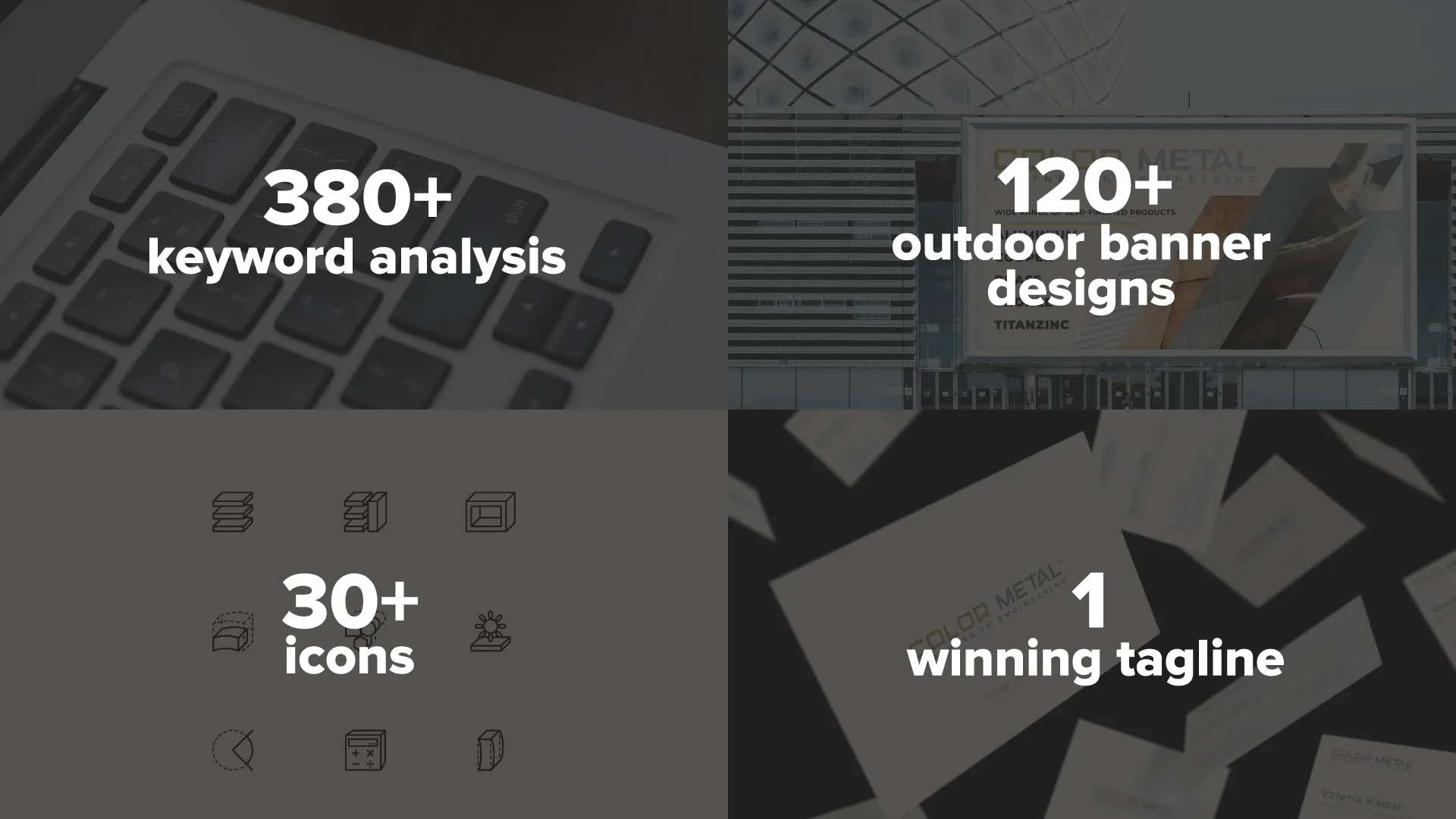
The project in figures:
